

According to Michael James, there are a few things that really make a difference when it comes to creating signs that do their job. They’re easy to spell out, but it takes effort and practice to incorporate them into your work.
I do a lot of routine signs and banners, and I find that keeping some basic principles in mind is a big help in creating effective layouts quickly. I’m including a few examples to help illustrate what I mean.
Nine guidelines that result in better-looking, more successful signs:
1. Edit the text if necessary. You can also edit copy in your layout by increasing or decreasing its impact.
2. Organise the elements in order of importance. Along with the primary copy, you’ll likely have two or three different secondary messages. You may also have a graphic or photo to deal with. Make sure the reader gets the message in the proper order by using letter size, weight and colour to organise the elements. Mike Stevens called this ‘prioritising the copy’ in his book, Mastering Layout.
3. Margins matter. Make a note of how many signs you see that have very little margin around the lettering. Having adequate margins is an important step to having an effective sign because it makes the lettering easier to read.
4. Choose appropriate fonts. A typeface helps create a certain mood or feeling, and that feeling has to be appropriate for the situation.
5. Don’t distort fonts. A good example of the damage this does is when someone condenses a font so much that the horizontal strokes become thicker than the vertical strokes. It’s very unattractive.
6. Avoid monotony of colour and size – without contrast, lettering can be boring. You lose your reader before you even start.
7. Consider location and reading distance. This is critical. You have about three seconds to read a sign along the highway. If you’re walking along the pavement it’s a different story — you have more time to decipher the message.
8. Clutter is the enemy of readability. This happens on a lot of wrap designs — there’s just too much going on, and readability suffers.
9. Less is more.


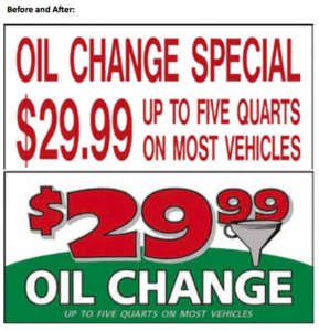
For the image below, a local lube centre needed a banner to advertise their $29.99 oil change promotion. The old banner was in pretty bad shape and needed to be replaced. I asked the owner if I could tweak the design to make it a little more effective. The old banner is a victim of ‘Helvetica Misuse Syndrome’. The font was overused in the layout, then squeezed to the max. The result was a monotonous design. Using the same colour on all the lettering didn’t help the design either. I incorporated the colours of the franchise chain to tie in to their brand. Adding the funnel graphic and a shade on the price created a little more interest and character.
On my version, I chose a more appropriate font for the company name and added the repeating trees to support the management aspect of the business. Using script for the owner’s name gives the design a touch of personality. Eliminating the word ‘Owner’ helps reduce unnecessary ‘weasel words’ — vague words with little meaning to the reader. I limited the font selections to three in keeping with a cardinal rule of design. Varying colours and font weights helps avoid a monotonous layout as well.
Published with permission from SignCraft Magazine.


